
Social media is a great place for businesses to build their brand and audience and market themselves in today’s times. In fact, nearly 92% of businesses use social media for marketing purposes.
While that number is huge and makes a strong case for promoting your business on social media, it also shows how this space is becoming increasingly competitive.
Luckily, there’s a way you can cut through the competition and make your brand stand out—and that’s by creating a social media aesthetic for it.
A social media aesthetic helps you accurately reflect your brand’s vision and tone, maintain consistency across channels, and, most importantly, build brand recognition and recall value.
Consider Tiffany & Company, for instance. When you think of the brand, the first thing that comes to your mind is Robin’s egg blue color. They used this color in all their packaging and branding, and it became so widely associated with their brand that, now, it’s simply called the “Tiffany Blue.”
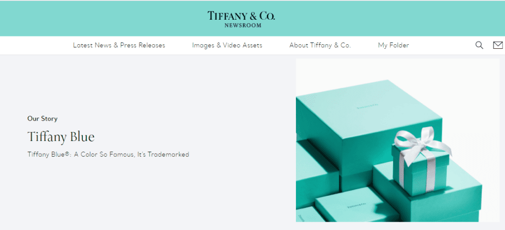
That’s the power of creating a brand aesthetic—and by applying it across all your social media channels, you can considerably boost your brand’s online presence and sales.
Don’t just take our word for it—research suggests that presenting a brand consistently across platforms can increase revenue by 23%, and that’s a significant number to miss out on.
This article will give you a direct roadmap to building an impeccable social media aesthetic for your brand that catches your audience’s attention and drives more traffic to your social media pages.
Let’s begin!
8 tips to create a social media aesthetic for your brand
1. Understand your target audience
The first step in creating a social media aesthetic is understanding your brand identity—your goals, core values, tone, and personality. It’s also one of the most crucial steps in social media marketing, that complements how you organize your social media and create content to convert visitors into customers, or simply grow your social profiles.
Most importantly, you need to be clear about who your target audience is and what kind of design, visuals, and content they like to best cater to their needs and interests.
So, before you begin, ask yourself these questions:
- What’s your brand’s personality? (serious, fun, assertive, calming)
- Is your brand gender-specific?
- What is the ideal age group of your target customers?
- What are their likes, interests, and habits?
- What kind of content does your audience engage with?
- What aesthetics appeal to them?
You can also go through your website and past marketing materials to find common patterns and styles that you might want to include in your social media aesthetic. You can also unearth data from the media you use to communicate with your audience. This can include email, unified communication systems, and other types of communication for customer support.
The idea is to get a firm understanding of your brand and who it’s for so you can create an aesthetic and content plan that’s best suited for both.
2. Research competitors
The next step in creating a social media aesthetic for your brand is to research your market and competitors. This can help you understand what content attracts your audience and inspire your own branding.
When researching your competitors, make sure to study:
- How they’ve designed their profile
- What type of content they create and how they structure it
- What fonts, colors, and designs they use
- What emotions their designs evoke
- What kind of following they have
- How they engage with their audience
- Their level of consistency
Besides giving you a sense of direction on how to get started, this exercise will also help you understand what you like and don’t like about your competitors’ social media and what you can do to one-up them.
3. Define the brand aesthetic you want to project
Now comes the interesting part. Once you know what your brand stands for and the customers you’re targeting, it’s time to decide and lay down “your” aesthetic.
Steps one and two of the article would’ve given you a good sense of the aesthetics you want to go forward with. Besides this, you can also browse other brands and use platforms like Pinterest to see what colors, aesthetics, and designs appeal to you.
That said, don’t restrict yourself to social media to get inspiration for your brand aesthetic. For instance, going through magazines or advertisements to find fonts, colors, or designs that speak to you is also a brilliant idea.
The only thing to keep in mind here is to take inspiration from and not blatantly copy other brands—remember, the goal of a social media aesthetic is to make your brand stand out.
Now, once you’ve brainstormed ideas, define these aspects of your brand aesthetic:
- Brand tone and messaging: Your brand aesthetic significantly depends on its personality—whether it’s elegant and sophisticated, dynamic and robust, powerful and empowering, or subtle and sweet.
Consider Country Bean here. Their Instagram aesthetic instantly tells you their brand is fun and playful.
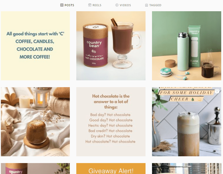
On the other hand, a sober-looking aesthetic can be a better idea for a brand trying to convey a serious message, like promoting a sustainable and eco-friendly environment or women empowerment. Let’s look at some things that can go into defining your brand aesthetic:
- Overall theme: Think about what theme will best reflect your brand and the content you create. Pepper’s Instagram account is an excellent example of this. Their Instagram feed follows a light-colored theme which gives off a soothing yet playful vibe.

Once decided, make sure to follow this theme across all your social media accounts to give your brand a consistent look, so customers can recognize it in a jiffy—without even looking at the brand’s name.
- Images: What kind of images will you post on your social channels? Does your brand go better with camera pictures or graphics and illustrations? Consider these factors before deciding on a brand aesthetic as visuals and graphics majorly lead the social media wave, and stand at the center of profile aesthetics. You might want to explore aesthetic pictures that resonate with your brand’s identity and appeal to your audience’s visual sensibilities.”
- Emotions: What emotions do you want to evoke in your audience when they see your profile and designs? This will directly influence the colors you choose for your social media aesthetic, which brings us to our next point.
4. Choose a color palette
Tiffany & Company’s example clearly shows the importance colors hold in establishing your brand. In fact, in a study, 59% of the consumers said that color helps find brands while shopping online.
Given how they help you build recognition for your brand, it’s crucial to spend sufficient time finding and choosing colors that reflect your brand’s values and resonate with your audience.
It’s also important to know what emotions people associate with different colors. Brand strategist Vanshika Mehta recently shared how she decided to go for bright yellow or magenta for a pet food company’s branding. That’s because these colors evoke emotions of care, love, warmth—which is what owners feel while feeding their pets.
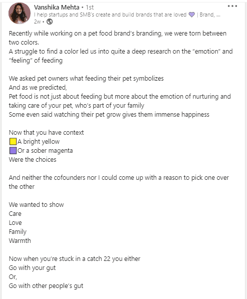
Similarly, you need to understand what emotions you want to evoke through your brand and products and finalize your color palette accordingly. For example:
- Red instantly catches the eye and induces urgency and excitement. Fast food brand KFC perfectly infuses red in their Instagram posts.
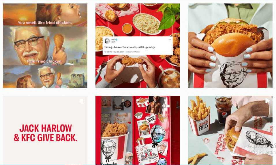
- Blue creates a feeling of trust and shows professionalism—LinkedIn’s aesthetic practices are a great example of this.

Fun fact: Blue also reduces hunger, which is why the F&B industry doesn’t use it often.
- Green signifies health, peace, calmness, and nature, which is why eco-friendly brands use it often.

- A multi-color theme conveys variety, playfulness, and creativity, as StudioDIY’s Instagram account shows.

These are just a few examples—you can go for any color(s) that matches your brand’s intent and goals.
But the question is, how do you create a color palette for your brand?
If your brand already has a logo, you can create a palette using similar colors and build a social media aesthetic around them. If your brand doesn’t have a logo you can quickly whip up one with Designhill. It will help you create other visuals too.
Another exciting way is to use a tool like Coolors, which creates a color scheme for your socials based on your brand’s existing colors. It even offers premade color schemes so you can easily pick one that best suits your brand.
5. Pick a unique font
Another integral part of your social media aesthetic is the font you use. Using the same font consistently can help you build a cohesive brand identity and presence and help your audience recognize and remember your brand. Fitness brand 9Round here is a great example of this:

Now, you can pick a font for your brand the same way you choose your color palette, i.e., based on what matches your tone and personality.
So, for instance, you can go for Serif fonts for a more classic or traditional look. On the other hand, Script fonts can be good to give your social media brand a touch of modernity and creativity—if that’s what you want to project.
Instead of making a pick right away, you can also create sample posts and see which fonts look best to you. What’s more, you can even choose 2-3 fonts and just use them consistently on your social media.
6. Create a mood board
Creating a high-quality visual mood board is a great way to seek inspiration for your social media aesthetic and convey what you want to your team.
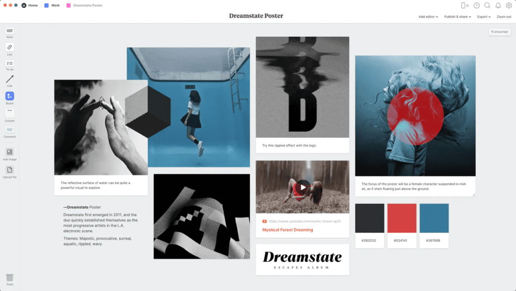
Here, you can add all images, fonts, designs, visuals, colors, and content ideas that appeal to you. This can help your designers, marketers, and content creators know what theme, concept, mood, and feel you’re going for—ultimately bringing consistency to your social channels and building recall value with customers.
You can also let your team collaborate on and contribute to this board, so you can get a diverse range of ideas and pick the most-suited aesthetic for your brand.
7. Create templates
Now that you’ve decided on your brand colors, fonts, and theme, it’s time to put them all together into a toolkit so your team can access everything from one place. You can simply use a platform like Google Drive or Dropbox to save all your aesthetic resources.
Here, it’s also important to include your templates for different social media platforms so you can maintain consistency in your posts, and don’t have to create them from scratch.
While your primary color palette, fonts, and content will remain the same across platforms, each has different requirements for post and image sizes, and hashtags, which is why creating templates can come in handy.
And, it’s not as difficult as it sounds. All you have to do is create a template for one social media (using the color palette and fonts you selected) and then simply customize it for others based on their size requirements.
An app like Canva is excellent for this. You can create and store all your templates here, and it even comes with premade templates for each platform that you can customize using your brand’s color and fonts.
8. Develop a content calendar
You would have established a solid base for your brand’s social media aesthetic by following the above steps. However, your job doesn’t end here.
It’s now time to put the aesthetic you decided into action—and the best way to give justice to the time and efforts you put in till now is to create a social media content plan for this.
Your brand can choose fantastic colors, typography, and designs. Still, your entire social media aesthetic will go for a toss if you don’t plan your content and organize your posts carefully.
This is why creating a content calendar, which specifies how often you’ll post in a month, what you’ll post, and when becomes essential.

And as you develop your content calendar, make sure to add variety to your posts. Create and experiment with different types of posts (carousels, images, quotes, Stories), post on different days and different times—this will help you understand what works best for you and what your audience appreciates the most, so you can double down on it.
Now create your social media aesthetic
Creating a social media aesthetic is a need more than a choice if you want to establish or grow your brand on social media. Besides helping you create a consistent and visually pleasing feed, it also enables you to stand out from your competition and create a unique image for your brand in your audience’s mind whether.
As important as it is, creating a social media aesthetic is also an exciting exercise that can help you look deeper into your brand and understand your goals and your audience better.
Follow the eight tips highlighted in the article above whether you are creating an Instagram story, Facebook ad, or meme, and you’ll build a strong base for your brand’s social media presence and set it up for success!
About Rachel Bowland
Rachel Bowland is the content manager at Social Marketing Writing. She likes to write about marketing and design.
