
5.89% is the average landing page conversion rate across all industries, according to HubSpot data. They consider 10% a “good” conversion rate.
But why settle for average when there are tried-and-true, proven ways to maximize conversions?
In this post, I’m going to introduce you to six examples of landing pages that do lead generation extremely well.
But first, I’ll give you a checklist of what makes these landing pages’ lead generation tactics work and how you can implement them yourself. No matter whether you’re a well-established SaaS company with 10+ years in business, or you just bought the domain for a new business idea.
What You Need to Make Your Landing Page’s Lead Generation Work
Before setting sail, you need to know the route. You’ve probably seen hundreds of unique landing pages. However, the ones that work all have a few things in common while maintaining their individuality.
Here are nine elements your landing page needs to convert well. You can use this as a checklist. Then, I’ll go into six specific examples of landing pages that do at least one of these elements extremely well.
- Clear and Compelling Headline. This is the first thing your viewers are going to see. You need to instantly communicate the value proposition to capture attention. One of my favorite examples of this is Shopify. (Consider this a bonus seventh example.) Their headline is “Bring your ideas to life for $1/month.” Who wouldn’t read a little bit more after that? Then, add a supporting subline that provides additional context or benefits to reinforce the main message. In the Shopify example, it’s “The future of business is yours to shape. Sign up for a free trial and enjoy your first month for just $1.”

Alt text: Screenshot example of Shopify’s landing page headline
- Engaging Visuals. Use high-quality images or videos that align with the offer and evoke emotion. They don’t distract from the information, they support it by drawing in the right kind of attention. For example, many law firms—like Shaked Law and Norden Leacox—use moving, panoramic-type photos and slow-motion videos as their header images.
Other industries opt for stock photos, graphics, animated website elements, etc. - Lead Capture Form. This is where you ask a visitor to give their information in return for your offer. In other words, where they officially become a qualified lead. This is extremely important, so keep the form short and only request essential information to avoid abandonment
- Strong Call-to-Action (CTA). Tell potential leads exactly what you want them to do. This is your CTA. It’s action-oriented text like “Download the Free Guide” paired with a contrasting, bold button. This is what Jorge Argota does on all his pages by including a simple button that includes his contact information and the fact that he is available 24/7.
- Social Proof. Always include testimonials, case studies, reviews, or trust badges to build credibility on your landing page.
- Minimal Distractions. Simplicity is key. Avoid too many navigation bars, excessive links, or competing CTAs to keep your visitors’ focus.
- Responsive Design. Your landing page needs a seamless, fast-loading experience across all devices. This also means optimizing it for mobile. According to Think with Google, when a landing page goes from a 1-second to a 3-second load time—just a two-second increase—the probability that the user will bounce increases by 32%.
- Urgency or Scarcity. Creating FOMO (Fear Of Missing Out) has always been one of the best ways to make someone act now. In landing pages, this means using elements like countdown timers or limited-time offers.
- A/B Testing Capability. You need the ability to test your landing page to see if it’s working and what needs to be changed. This is where A/B testing comes in. Continuously optimize elements like headlines, CTAs, and visuals and see what happens to your conversion rates.

1. Best at Social Proof: Baumgartner Law Firm

Alt text: Example of social proof on Baumgartner Law Firm’s website
There’s no denying that social proof drastically increases a landing page’s conversion potential.
Just to throw out a few numbers, TrustPulse reports that testimonials on a sales page can increase the conversion rate by 34%. And 66% of customers in a survey told Trustpilot that social proof increased their willingness to buy.
Some of my favorite examples of social proof come from law firm websites. For example, Baumgartner Law Firm displays not just his client testimonials, but also his case results. These are dollar amounts of how much he’s been able to demand from companies his clients feel owe them.
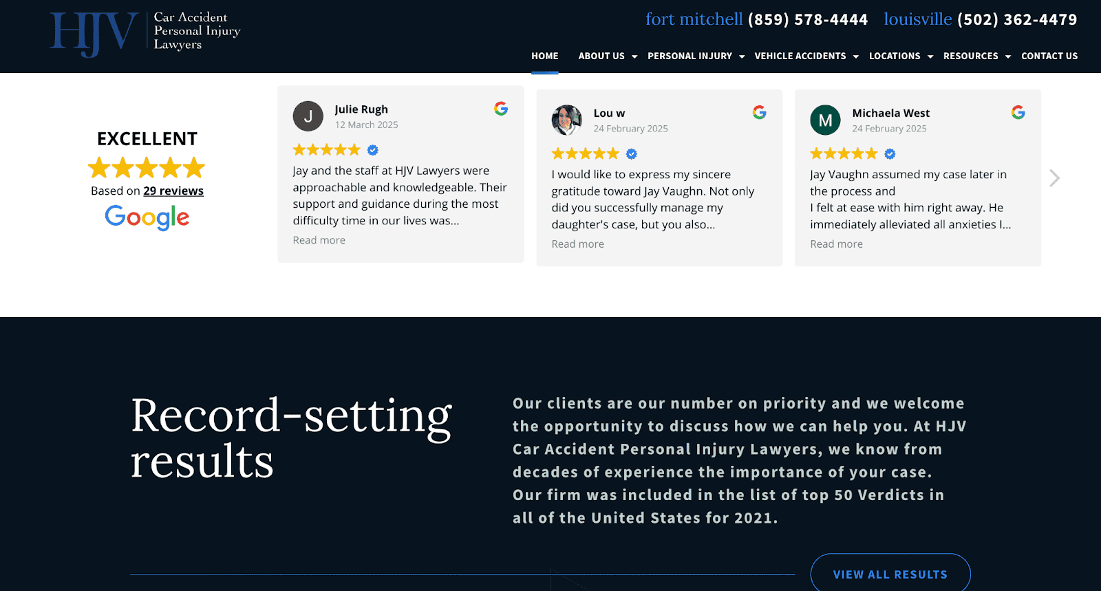
Another prime example is Vaughn from HJV Car Accident Personal Injury Lawyers. He uses a simple, user-friendly design that draws attention immediately to his five-star reviews.
Right underneath, there’s a link to a more complete and comprehensive results page that shows potential clients the firm’s experience in securing the best results possible for clients.
Here’s the last one.
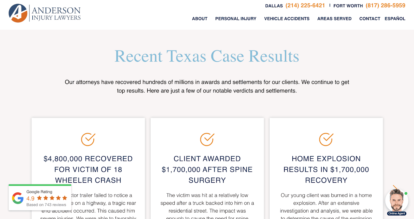
Anderson Injury Lawyers focuses on numbers when showing potential clients their results.
They feature six of their most recent verdicts and settlements through a sliding reel on their homepage with the exact amounts won and more information on each specific case.
This specifically works because it helps the trust factor for new clients that are discovering Anderson as a firm for the first time.
2. Best for User Simplicity: HubSpot

Alt text: Screenshot of HubSpot’s free demo landing page for their marketing software
HubSpot’s demo landing page is a masterclass in simplicity. The page immediately communicates its purpose: offering users a free demo of HubSpot’s platform.
The minimalist design ensures no distractions, keeping the focus on the main call-to-action—“Get a Free Demo.” This clarity eliminates cognitive overload, allowing visitors to quickly understand the value proposition.
The form is streamlined, asking only for essential information, such as name, email, and company details. This approach reduces friction and makes it easy for users to take action. The lack of excessive fields respects the visitor’s time, enhancing the likelihood of conversion.
Moreover, the absence of unnecessary navigation bars ensures that users remain focused on the page’s objective without veering off to explore other parts of the website. The inclusion of trust elements—like testimonials and a brief explanation of what the demo includes—builds confidence without overloading the page with text.
Finally, the mobile responsiveness ensures the page performs flawlessly across devices, accommodating users on the go.
3. Best Value Proposition: Social Marketing Writing

Alt text: Example of landing page value proposition on Social Marketing Writing’s website
Social Marketing Writing is run by Mitt Ray, an expert social media marketer who offers services like consulting sessions, social media strategy, lead generation, social media audits, and more.
But his homepage doesn’t try to sell his full services to newcomers who don’t know him right off the bat. He gives them free value first.
Matt offers 22 free drag-and-drop social media templates his potential clients can use on the platform of their choice. This lets them create high-quality content in as little as seconds. And just like that, a huge pain point for his target audience is solved.
He then continues to hook readers by explaining his other offers: an enormous content library with free ebooks, white papers, videos, etc.
If this is the value they get by using his free materials, imagine how much they can transform their social media strategy by paying for his time and individual attention. That’s what your value proposition needs to convince potential leads.
Uniqode does something similar with their QR code generator page:

You can create completely personalized QR codes on this page without even signing up! Talk about value on one page.
4. Best Lead Capture Form: LawRank

Alt text: Example of user-friendly design on LawRank’s website
LawRank is an SEO agency for lawyers and there are tons of reasons I like their landing page.
One, they incorporate video. Two, their subline is extremely attractive. They include a very measurable result that takes a second to read explaining what they’ve done for their clients. (A 384% increase in first-time calls and a 603% growth in traffic in 12 months.)
But what I want to focus on now is their lead capture form.
It has a sleek design, is easy on the eyes, and most importantly—is extremely simple and well-placed. Instead of a traditional static form that asks for all the user’s information at once, LawRank employs a four-step carousel that gives users a sense of progress as they work through it. And each slide only asks one question at a time, building trustworthiness.
The questions are simple and industry-relevant:
- What do you need help with?
- What type of law do you practice?
- Firm revenue range
- Contact information (first name, last name, email address, and phone number)
5. Best for Urgency: SHEIN

Alt text: Example of urgency on Shein’s website
Landing pages that provoke a sense of urgency can increase their conversion rates by up to 332%. SHEIN—an online clothing store—does this better than many companies, especially in the eCommerce space.
They’re always offering at least one type of discount or deal, usually with a timer that countdowns to when it expires. For example, the first thing they offered me was 30% off my order when I registered. And the guarantee that I can return any unwanted items for free as a US resident, which gives me a sense of comfort.
They also make effective use of pop-ups, offering you last-minute deals as you’re about to bounce.
You don’t have to go as over-the-top with discounts as SHEIN does. Especially if you’re not an eCommerce business. But if you want to maximize conversions, aim to create some sense of scarcity or urgency.
This can be as simple as your wording. For example, LawRank did this by adding “Find out if we have a spot in your market” to the end of their subline. This positions them as a sought-after firm whose services can’t be found just anywhere. There’s value in what they offer, and it’s scarce.
6. Best for Engaging Visuals: Workable

Alt text: Example of engaging visuals on Workable’s landing page
Brands often struggle to incorporate their individuality into a landing page that needs to also prioritize user-friendliness and easy navigation. But Workable is the perfect example of how this is 100% possible.
They have a very unique look that’s a core part of their brand identity. It’s sleek, modern, colorful, and animated. And they’ve made this user-friendly through elements and grouping.
As you scroll, the section breakers are very clear. Each feature has its own place with a static background color and different blocks of elements. Tons of screenshots give you an inside look at the product, and the explanations are short one- or two-liners placed into readable blocks.
This makes it insanely easy for their potential clients to find the feature that’s most valuable to them. And from there, they can lock in their attention and sell them on that one benefit.
Creating high-converting landing pages is simple.
Landing page lead generation isn’t complicated. Start by following the checklist at the top of this post. Draw inspiration from these six examples we just discussed. And then test, test, test until you’ve found the formula that works for your unique brand.
These landing pages’ lead generation tactics can be used across industries. So now, the only thing left for you to do is implement them.
About Freya Laskowski
Freya Laskowski is the founder of SERPManiac, an agency focused on helping brands scale their organic growth with content marketing and SEO services. She is a quoted contributor in online publications like Business Insider, Fox Business, Yahoo Finance, and the Huffington Post. She also owns CollectingCents- a personal finance blog that she grew from the ground up.