Your business logo is the one thing you use in nearly any type of interaction with customers. It signals to the world who you are and what you do and highlights your company’s attitude. Think about the many different locations your brand image appears, such as your website header, emails, packaging, and store sign.
At least eight unique types of logo designs exist. These creations fall into categories that include abstract, combination mark, mascot, emblem, lettermark, wordmark, dynamic and pictorial. The one you choose depends on your brand’s personality, as well as industry standards. It’s good to think outside the box and develop something no one else has done before. However, you are somewhat limited because a logo should also be concise.
There are some features to keep in mind if you want your logo to be one you use for years to come. Here are six elements of excellent business logos, plus corresponding examples of brands doing it right. You can implement these tips while using a simple logo generator or a sophisticated tool like Photoshop.
1. Understand the UVP
Before designing a business logo, (of course, you can always play around with a free logo maker), you must fully understand the brand’s unique value proposition (UVP). The logo must convey what makes the company stand out from similar operations. You know your business better than anyone. What symbols signify your core purpose?
A fabulous place to start with creating your UVP is studying those of your competitors. Yours must be different than all the others while still summing up your brand image in a few hundred pixels.

Expeditors is known for speedy delivery. Their logo reflects the fast aspect of their business by incorporating an emblem resembling wings. The symbol appears to be in motion because of the use of negative space between the red sections. What are you known for, and how can you show it through your emblem?
2. Create Something Timeless
While the latest trends show you’re on the cutting-edge of design, they don’t stay popular forever. You’ll find yourself redesigning your logo way too frequently if you chase after trends. One thing you can do is create a classic logo and then jazz it up with add-ons. Google does this often with their emblem.
They use a modern sans-serif typeface. For different holidays and occasions, they change the logo by placing it on a background or weaving animated elements around the letters. A wordmark offers flexibility when celebrating holidays and other events.
Start by choosing a typeface that sends the desired message. A classic font with serifs can convey that a business is decades old. On the other hand, if you want to be seen as a company that’s always at the forefront of the industry, you can choose a contemporary type.
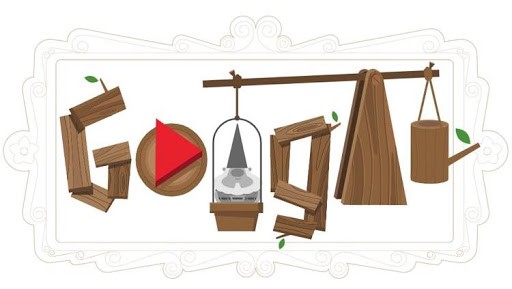
Google creates some exciting logos for various holidays and days in history. They sometimes use animation and create games users can play.

In the example above, you launch a gnome through the air to plant flowers. At other times, they share information about a famous historical figure or time in history. They also make simple modifications, such as a Santa hat on top of one of the letters.
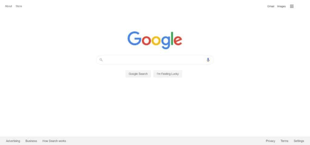
Their logo adjustments bring a lot of inspiration but always focus on the same typeface and letters. Other times, they keep things simple and don’t make any changes to the appearance.
3. Consider Scale
You can use your brand symbol in many different places. Think about the various placements and sizes you can use to create something scaled up for offline promotions such as decals or billboards. Your finished logo’s format will make a difference in how it adjusts to different situations. Scalable Vector Graphics (SVG) files retain clarity even in larger locations, for example.
You also want to make sure your logo is readable on small screens, such as smartphones. During the design process, take a step back from the computer and view the logo from different angles. We’ve all seen emblems that send a message the maker didn’t intend. Avoid embarrassment by getting multiple eyes on the project and gathering feedback.

Trident Seafoods keeps things simple with a blue and white color scheme. The trident is tall and slender enough to look good at a smaller scale and remain decipherable when blown up. The logo works on their packaging and website, and it would look equally good on a billboard or building.
Your emblem should look the same no matter where a consumer encounters it. Consider the format and test how it looks in high- and low-resolution situations.
4. Pick Color Palettes Wisely
Think about the many different places you’ll use a logo, including how you use images for social media promotions. If your colors are the same as every other company out there, people may just scroll on by. Your logo hues must evoke emotion but also be a bit different than those of your competitors. While most financial institutions use blue shades to indicate dependability, there are more shades of blue than you can imagine. Keep tweaking until you find just the right hue.
If you’re doing a logo redesign, you may be more limited by the colors your brand already uses. In those cases, add a new shade or incorporate a unique feature to make the symbol stand out from other designs in your industry.

Carrix uses a globe with a modern feel, which is similar to many other logos. Where they stand out is with the use of yellow. It’s a subtle effect that draws in the user. The color meshes well with the rest of their website’s color palette. Look for ways to incorporate pops of unusual color to catch people’s attention.
5. Use Black and White
When first designing your logo, create it in black and white. Limiting colors shows you any inconsistencies with how the logo might look on different backgrounds. Next, reverse the colors and test again. For example, if your logo is white, put it on a dark background. If your logo is black, put it on a white background. What you need to adjust becomes apparent.
You can also use a logo maker for your business to easily experiment with these variations and ensure your logo is versatile.
Sometimes you’ll print your logo in black and white, such as for a newspaper ad. Designing in black and white first shows you how it will look and whether it’s impressive to your target audience. Your emblem should still be eye-catching and unique, even without added color.
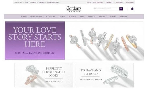
Gordon’s Jewelers has a simple black and white logo, which puts the focus on their name reputation. Although the design is black, they could easily reverse to white for a dark background. This namemark logo is a simple mix of letters, including a line between their name and the word “jewelers.” Although this style works particularly well for name logos, you could also use black and white for emblems, mascots and any other type of symbol. You can add color later.
6. Convey a Deeper Meaning
Look for ways to dig into who you are as a brand. For example, Nike’s name is tied to the winged goddess by the same title. The swoosh symbolizes speed and movement. Since they focus on sports branding and “just doing it,” the logo works perfectly for their brand and name.
Other times, the typeface you select can send a message of strength or youth. The colors in your logo mean different things as well. If you want to generate excitement, you might add a splash of red. Color psychology can take your branding to the next level — study the meanings of various hues and find one that matches your goals. Use a dominant color for the primary feeling you want to convey and pull in others for your accents.

C+W O’Brien Architects added a bright color to their minimalistic logo. A dash of green breaks up the interlocking transparent boxes. The green symbolizes the community aspect of their designs. They focus on environmentally friendly options while still meeting the needs of commercial clients. The emblem goes perfectly with the background images of the interiors and exteriors of buildings they’ve designed.
Brainstorm some symbols tied to your business model. What are some words that come to mind? Choose figures that highlight those words, such as a house for family or a swoosh for speed. Don’t copy what anyone else has done, but come up with individual symbols no one else uses for their logos.
Put Pen to Paper
Start today by sketching out your ideas and documenting words and colors associated with your brand. Once you have some concepts down, start creating potential designs. As you go through each stage of the creative process, think about how the final product will work for different media. Will it send the message you want for your brand? You’ll have to live with your logo for many years, so come up with the best representation of your brand identity.
About Lexie Lu
Lexie is a web designer and branding enthusiast. She loves hanging out at flea markets and taking her goldendoodle on hikes. Follow her on Twitter @lexieludesigner and check out her design blog, Design Roast.
