Are you making use of email in promoting your blog? Would you like to increase blog email subscribers?
In the midst of building their presence on the top social media like Facebook, Twitter, Pinterest, Linkedin, etc. and then experimenting with the latest ones, many blog owners forget about the importance of email and the necessity to build a list.
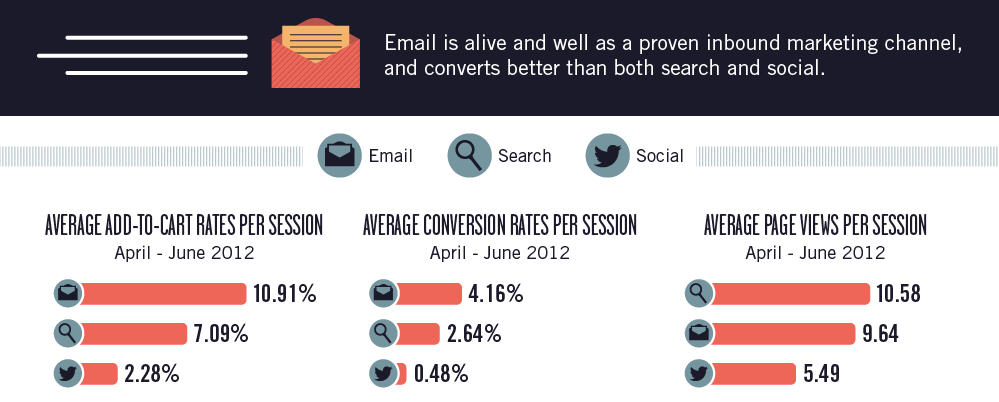
Email can be a valuable asset to any blog or business as according to Monetate it has a better conversion rate than social media and online search. It also helps you drive more website traffic and blogs can make some extra revenue by including an ad in their email newsletter. I have written how Social Media Examiner earns really good revenue through email in my post How to Get More Than 200,000 Email Subscribers in Less Than 4 Years. This makes building an email list essential.
I have gone around the web and found seven statistics that can help you rapidly increase blog email subscribers. Check them out below…
1. Create a great landing page:

A well optimized landing page with an extra signup form, great copy, headline, etc. can increase subscription rates by 321% as found out by Aweber.
When Aweber optimized their landing page with a new headline, new copy and with the addition of an extra opt-in form (they had two opt-in forms on the same page) the subscription rate went up by 321%. You can see the changes made to the sign up form on this image.
So just like Aweber, work on your landing page and do a split test to see what increases sign-ups. You could also get rid of all distractions like the menu, ads, sidebar, footer, etc. to check if it has a positive effect.
2. Use a feature box on your home page:
A feature box is an opt-in form that can be placed right on top of your website (where the header is). It can increase sign ups significantly as found out by DIY Themes.
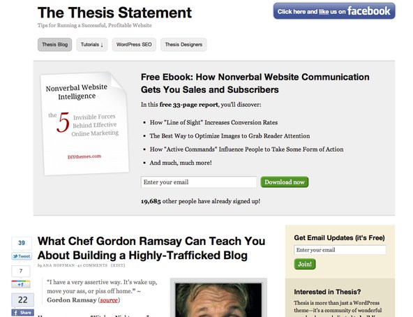
DIY themes placed a feature box above the content and the side bar on the home page only. This feature box consists of copy used to convince the reader to sign up (with the help of a free ebook), an image of the cover of the ebook and a field where one could enter their email to sign up. They also stated the number of subscribers they already had.
After doing this, the daily new subscribers to the blog went up by 51.7% overnight. So this is something you should definitely try out. Like DIY Themes you can place it on the homepage so as to not annoy your readers too much. But if you would like to, you could place it on top of all the pages and see how that works by checking if it effects page views, bounce rate and time spent on the website.
3. Offer an Incentive:
An easy way to get people to sign up is to offer an incentive of some kind. This could be a free gift like a guide, tutorial or a white paper.
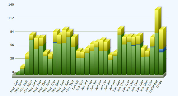
Chris Spooner discovered that this technique can rapidly boost your subscription rate as see in the above graph. Initially, Chris Spooner just offered a regular sign up to my updates form so that people could receive his blog updates. But then he made an alteration and began offering a bundle of design resources as a free gift. This change along with the placement of the form in several places on the blog increased his daily subscriptions from ten to hundred.
So think of what your readers want and create a free gift like Chris Spooner and offer it in exchange for a sign up.
4. Change wording on the Button:
Chris Spooner also experimented with changing the wording on the button and found that the words ‘Download Now’ achieved three times more sign ups than ‘Get Email Updates’.
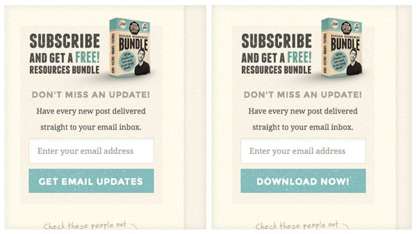
You can see both the forms side by side in the above image.
Just like the above experiment you can try out other words like ‘Sign up’, ‘Subscribe’, ‘Join Now’, etc. and see which one works best for you.
5. Change the colour of the sign up button:
Changing the colour of the ‘Sign Up’ or ‘Subscribe’ (call to action) button on the opt-in form can also make a difference. A test was run on the homepage of Performable’s website. Here two homepage’s were created with the same copy and design. The only difference between the two pages was the colour of the call to action button. One of them had a red call to action button and the other, green.

You can see both the home pages side by side in the above image. The test was to see which colour would result in a higher click through rate. At the end of the test it was found that the red button received 21% more clicks than the green button. The study shows the importance, the colour of the button has on conversion rates. Though this study wasn’t conducted on email opt-in forms, it still applies here.
This doesn’t mean that you need to go ahead and change the colours of the buttons on your opt-in forms to red as the same colour might not work for everyone. You need to perform the same test like Performable and find out which colour will work best for you. Some colours you could try and experiment with are green, red, orange, blue and pink.
6. Reduce number of fields to sign up:
An easy way to get more people to sign up is by placing fewer fields in the opt-in form. Neil Patel conducted this experiment on his personal website where he reduced the number of sign up fields which resulted in increased conversions.
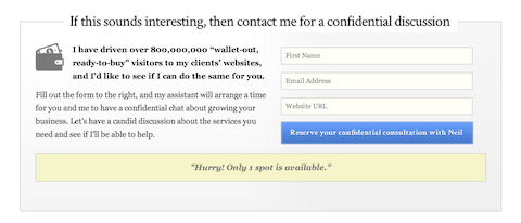
His submission form contained four fields – Name, Email, URL and Revenue. In his experiment he removed the revenue field, this cut the number of fields in the opt-in form to three. The removal of the ‘Revenue’ field increase subscription rate by 26%.
In a similar way you can alter the number of fields and perform split tests to check what works best. You can ask for more details in the future after you have acquired the visitors trust.
7. Use a popup:
Many people avoid using popup forms as they find them annoying and feel that placing them on their websites will annoy their visitors too. This can be true, but the fact that popup forms can increase sign ups drastically as discovered by Darren Rowse, is something that cannot be ignored.
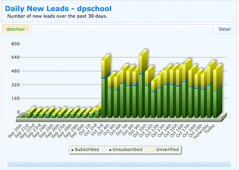
As seen in the above graph, on his Digital Photography School website, Darren Rowse was only getting 40 new subscribers a day and after he installed the popup form, the number of subscribers shot up to 350 subscribers a day.

And this didn’t have any negative effect on the blog, as page views per visitor remained almost the same (there was a slight increase). So popups are something you must try out.
For good results try out Aweber as you will have the option to let the pop-up appear only once so as to not annoy your readers over and over again.
Try out the above tips and get more people to subscribe to your blog or website. And like many of the above examples experiment and see what works best for your website.
To have all our latest articles emailed straight to your inbox Sign Up to our blog updates and get the Free Pinterest Marketing Video Tutorial.
What is the best way to increase blog email subscribers? What has worked for your blog? I would like to hear your thoughts. Please leave your comments below.
